How I helped Galp save 500 hours before MVP with early design system adoption
Galp • 2024 - Ongoing
Design System
DesignOps
Design Leadership

From brandbooks to a living system
Galp is one of Portugal's leading energy companies, with dozens of digital products spanning energy, mobility, and services. In 2024, the company embarked on a full rebrand. It was the perfect moment to rethink how design and development worked together across the organisation.
For years, teams had been building without a shared foundation. Brand guidelines dating back two decades were still in circulation. The rebrand made change unavoidable and created a rare window of alignment to build something that would last.
Nobody knew what existed
The core problem wasn't aesthetic, it was organisational. Without a centralised library or clear ownership, every team was solving the same problems on their own. The same button, the same form, the same pattern, built over and over, each time slightly different.
Design decisions weren't surviving handoff. Products looked inconsistent. And nobody could really answer the question: what already exists?
Currently, no one knows exactly what already exists. There's uncertainty, and teams often turn to the Branding team for answers. Having something centralised that promotes efficiency, speed, and consistency will be transformative.
Frederico Conde, Brand Design & Tech Lead, Galp
What we set out to change
We weren't just building a component library. The goals were broader:
Ensure brand consistency across all digital touchpoints with a single source of truth
Reduce duplicated effort and speed up design and development
Embed accessibility and inclusive design into every component from the start
Enable teams to work autonomously, without depending on brand or UX for every decision
Shift the culture from static brandbooks to a living, maintained system
The foundation Galp was missing
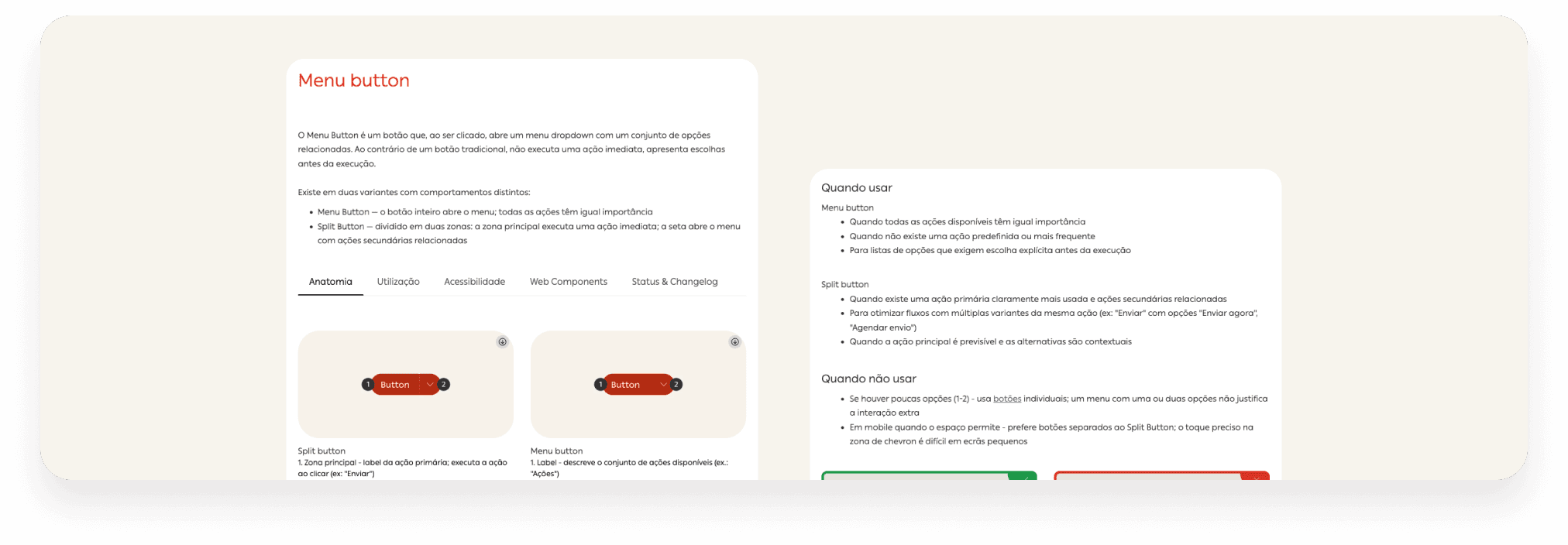
What we built wasn't just a Figma library. It was a full system spanning design, development, and documentation.
64 web components · 58 Flutter components · 19 products using G-Power today
Token architecture: primitive → semantic → component
Figma libraries with variants, states, and documented component properties
Frontify as the single source of truth for guidelines and documentation
GitHub for versioning and design-dev collaboration
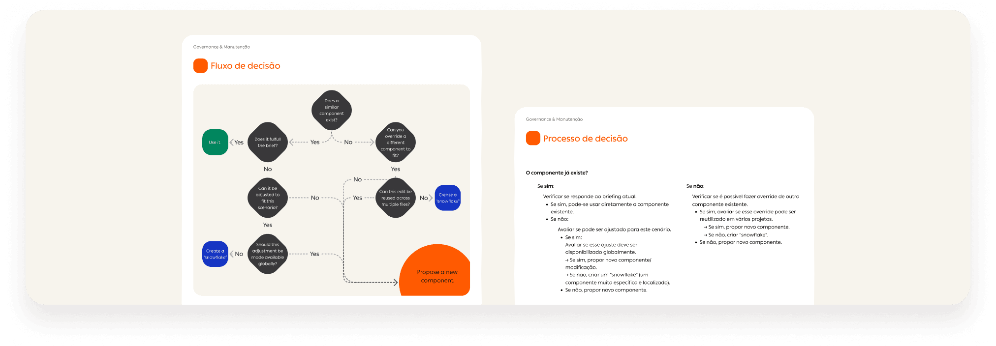
Governance model with clear contribution and approval processes
Adoption programme with tiered onboarding, Jira templates, checklists, and adoption plans, so teams could start without having to figure out where to begin
How we worked
We kicked off with deep discovery, auditing various products and conducting interviews with stakeholders, designers, and developers across multiple teams and departments. The goal was to understand the real pain points before designing anything.
From there, we built the foundations: colour, typography, spacing, accessibility, and other tokens. Then, we built the components around the most common needs identified in the initial assessment. Then we defined the governance model, with clear processes for proposing, reviewing, and approving new components.
The hardest part: the system launched while it was still being built. Product teams started using alpha-stage components before the MVP was finalised. That meant supporting adoption in real time, fixing issues under pressure, and iterating without breaking what was already in production.
We maintained tight rituals: daily syncs between design and development, and weekly stakeholder alignment to keep everything moving without losing quality.
500 hours saved. And counting.
The early impact was tangible. Before the MVP was even finalised, several product teams had already started integrating G-Power, which was a strong signal that the system was being seen as an enabler, not a constraint.
500h saved in one product alone before MVP
~€5,400 in avoided corrections
19 products referencing G-Power today
But adoption is rarely a binary. Some teams have embraced the system fully, tokens, components, governance and all. Others have adopted the visual language without going deeper. Driving meaningful, consistent adoption across a large organisation is still an active challenge, and one I'm currently working to solve through better onboarding materials, clearer governance, and closer collaboration with product teams.
There was a moment when we were in alpha and products already needed to start using it. The team had to support teams while the system was still being built, and showed a great ability to adjust at the necessary speed.
Frederico Conde, Brand Design & Tech Lead, Galp
What I'd do differently
The most painful lesson: token alignment between design and development needs to happen before anything else is built. Early in the project, design tokens and code tokens weren't fully in sync, which created rework that could have been avoided with more upfront alignment.
I'd also invest more time in foundations before moving to components. The pressure to deliver components fast is real, but a shaky foundation creates compounding problems down the line.
And tooling decisions matter more than they seem. Committing to a stack before fully understanding it costs time. Validate the tools early, even if it slows the start.
From builder to lead
I joined this project as a designer focused on execution, building components, speccing tokens, and supporting developers in real time.
Two years later, I own the backlog, set the priorities, coordinate with stakeholders, and lead adoption across the organisation.
G-Power isn't finished. It's a product, constantly evolving to meet new demands. And that's exactly how it should be.
Still building.